

The colors in graphic design: how they impact your brand and packaging
Colors are capable of conveying different sensations. In graphic design, it's the same thing. To plan an identity, it is important that you know more about the characteristics of each one. Colors are present everywhere and it is common to wonder about the best combinations.
Combinations of shapes and colors are crucial for harmonizing the elements of a brand, business and packaging. It is noteworthy that for everything we create, it must be harmonized with the consumer's personal tastes and compatible with the proposal of the product or brand.
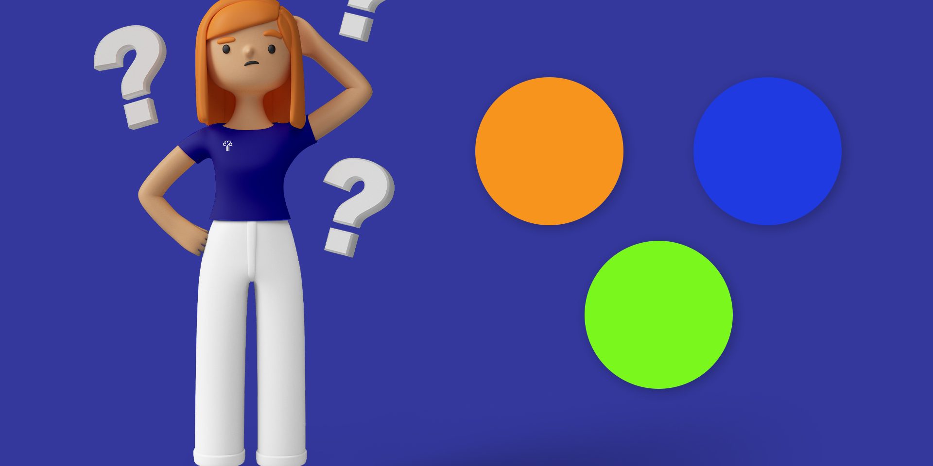
They are also capable of stimulating sensations and emotions. Blue, for example, conveys a feeling of calm and tranquility, while orange stimulates enthusiasm.
When it comes to colors, there are two types: cool and warm colors. The cool ones are classified by blue, violet and green, while the hot ones are red, orange and yellow.
Colors meaning:
Know the main meanings that our brain identifies when it sees such colors.
- Blue – Tranquility, serenity and harmony.
- Green – Hope and freedom.
- Yellow – Light, warmth, optimism and joy.
- Purple – Magic and mystery.
- Pink – Romanticism and tenderness.
- Red – Energy and passion.
- Orange – Success and vitality.
- Brown – Seriousness.
- Gray – Stability and neutrality.
- White – Peace and purity.
- Black – Respect and isolation.
Emepê Tip
Talk to our team to verify the best development strategy for your packaging. We have several possibilities of finishes, prints.

")